

If your goal is stakeholder-ready dashboards (Looker Studio, exec reporting, client views), pick a tool based on how you want data to move:
- Best “native Looker Studio” experience (fastest dashboards): OtterlyAI (Looker connector + prebuilt template)
- Best for teams who want Looker Studio + strong visibility/citations fields: Peec AI (community connector + documented fields)
- Best for BI pipelines and custom analysis: Profound (REST API + official
- SDKs)
- Best for enterprise teams who want AI visibility alongside broader SEO intelligence: Conductor (Data API includes AI visibility signals)
Best budget-friendly monitoring if you mainly need visibility scoring + exports: Promptmonitor (visibility scoring and multi-platform coverage)
Table of Contents
📋 Get Listed / Advertisement
We update this guide monthly. Want your tool featured? Contact: [email protected].
Best AI Visibility Tools (Quick Comparison)
| Tool | Best for | Looker Studio / BI options | Notes |
|---|---|---|---|
| OtterlyAI | Fast client dashboards | Native Looker Studio connector | No API currently |
| Peec AI | Custom dashboards + citations | Looker Studio community connector | Clear fields (visibility, citations, sources) |
| Profound | API-first pipelines | REST API + SDKs | Best if you want BigQuery/dbt/warehouse flows |
| Conductor | Enterprise SEO + AI visibility | Data API | Good when you want AI visibility inside a broader SEO program |
| Promptmonitor | Lightweight monitoring | Typically export → connector → Looker | Strong scoring + geo/platform coverage; BI depends on your setup |
📋 Get Listed / Advertisement
We update this guide monthly. Want your tool featured? Contact: [email protected].
▶️ Explore
What “AI visibility” reporting needs to include
Most teams start AI visibility tracking the same way they started SEO rank tracking years ago: “Just tell me if we show up.”
That works for a week, then leadership asks the questions that break basic reporting:
- “Do we show up more than competitors?”
- “Are we being recommended or just mentioned in passing?”
- “Which sources do the engines cite, and can we influence them?”
- Can we ship a weekly dashboard that doesn’t require screenshots and manual cleanup?”
- “Can clients see it without buying another seat?”
When you add Looker Studio (or any BI layer), you’re basically saying:
“We don’t just want a monitoring tool. We want a repeatable data product.”
That changes what “best tool” means. The winning tool is the one that gives you:
- Stable metrics you can trend
- Dimensions you can slice by (engine, prompt tag, country, competitor set)
- Exports/connectors/APIs that don’t turn into a weekly fire drill
Core metrics you should expect (minimum viable model)
Here’s a practical metrics model you can use across most AI visibility platforms (even if each tool names things slightly differently):
Brand presence
- Coverage %: % of tracked prompts where your brand appears
- Mentions: total count of brand mentions across responses
- Avg rank/position: if the tool detects ordering (e.g., “Top 3 recommendations”)
- Share of voice: your presence relative to competitors in the same prompt set
Citations & sources
- Citations count by domain
- Citation share %: your share of total cited domains (or citations)
- Top cited URLs: which specific pages are being used as evidence
Prompt & segmentation
- Prompt tag: intent or funnel stage (e.g., “comparison”, “pricing”, “alternatives”)
- Prompt topic/entity cluster: product category, use case, region
- Engine: ChatGPT, Perplexity, Gemini, AI Overviews, etc. (coverage varies by tool)
For example, OtterlyAI’s Looker Studio connector exposes fields like Brand Coverage %, Share of Voice %, Brand Rank, and several citation metrics (citations, citation share, ranks). Peec’s Looker Studio connector documents dimensions like Brand, Source: Domain, Date and metrics like Visibility, Citations, Chats.
Executive rollups vs analyst drill-down
A BI dashboard usually has two audiences:
Exec audience (10 seconds):
- “Are we up or down this week?”
- “Where are we losing to competitors?”
- “Which engines and regions matter?”
Analyst audience (10 minutes):
- “Which prompt clusters changed?”
- “Which sources are being cited?”
- “What content actions should we take next?”
So your data model should support both:
- Rollups: weekly trend lines, top competitor deltas, headline share-of-voice
- Drill-down: prompt list, response snapshots (if tool supports), source URLs/domains, tags
Client views & permissions (BI-driven delivery)
If you’re an agency or you report across multiple stakeholders, Looker Studio becomes the “front end”:
- Clients can see dashboards without tool logins (depending on your connector model)
- You can build templated reporting and duplicate across accounts
- You can control views by workspace/project parameters (if the connector supports it)
OtterlyAI explicitly positions Looker Studio reporting for teams/clients who don’t need an OtterlyAI login. Peec’s connector supports connecting a project and creating reports for collaboration and sharing.
1. OtterlyAI

What it does
OtterlyAI is an AI search monitoring tool that tracks how brands show up across AI engines and makes that data reportable in dashboards, especially through its Looker Studio connector.
Why teams use it
Because it’s built for operational monitoring and reporting, connect the data, ship dashboards, and share them with stakeholders who don’t need a tool login.
What it’s good for
- Agencies building client-facing dashboards quickly
- Marketing teams who want live reporting without building an API pipeline
- Teams that want standard AI visibility metrics (coverage, share-of-voice, rank, citations) available in Looker Studio
When it’s a good fit
- You want a native Looker Studio connector and a pre-built template to start fast
- Your reporting cadence is weekly/monthly and you value convenience over custom engineering
- You’re okay if the BI layer is primarily Looker Studio, not a data warehouse
When it’s not a good fit
- You need a first-class API for programmatic exports (it’s not available yet)
- Your org requires warehousing everything in BigQuery/Snowflake as a governance standard
How to use it
OtterlyAI’s connector setup flow is straightforward: select workspace + brand report, optionally filter by engine or tag, then create the report (either from scratch or via the included template)
Recommended dashboard layout:
- Page 1: Exec overview (coverage %, share of voice, rank trend)
- Page 3: Citations (top cited domains + your domain’s trend)
- Page 4: Tag comparison (e.g., “TOFU prompts” vs “BOFU prompts”)
OtterlyAI also documents a process for comparing tags by adding the connector twice, one per tag, and keeping sources separated.
Key capabilities
The Looker Studio connector exposes:
- Brand metrics (coverage %, mentions, share-of-voice %, rank)
- Domain metrics (domain coverage, domain rank)
- Citation metrics (citations, citation share, citation rank)
- URL metrics (cited URL + number of times cited)
That’s enough to build executive views and source-level action dashboards.
Pricing
OtterlyAI’s pricing starts at $29/month.
Free tier?
OtterlyAI doesn’t list a free-forever tier, but it does offer a free trial.
Downsides / limitations
- No API for exporting data today (roadmap item).
- If your BI stack requires warehousing, you’ll be doing workarounds (e.g., scheduled exports + ingestion), rather than a clean API pull.
2. Peec AI

What it does
Peec AI is an AI search visibility platform with a Looker Studio community connector that imports AI visibility data (visibility, citations, chats) into Looker Studio for custom dashboards.
Why teams use it
Peec is popular with teams who want dashboards that look like their existing performance reporting, filters, charts, stakeholder views; without being locked into the vendor UI.
What it’s good for
- Looker Studio dashboards built around visibility and citations
- Competitive reporting: “who’s winning share-of-voice in AI answers”
- Teams that want a connector with documented dimensions/metrics
When it’s a good fit
- Your org already uses Looker Studio for marketing performance
- You want to create a single “AI visibility” page inside an executive reporting hub
- You value having clear field definitions (Brand, Source: Domain, Date, etc.)
When it’s not a good fit
- You need connector completeness across every internal metric (community connectors sometimes lag behind the UI in exposed dimensions, plan for gaps)
- You want a guaranteed enterprise API at all tiers (availability can vary by plan and roadmap; confirm with vendor)
How to use it
Peec’s docs outline the typical connector flow:
- Access connector
- Authorize (OAuth)
- Configure project
- Connect and validate fieldsThen create a report and build visualizations (charts, tables, filters).
Fast-start dashboard ideas using Peec fields:
- Trend line: Visibility over time
- Table: Source domains by citations
- Filter: Brand, date range, domain
Key capabilities (especially for BI)
Peec’s connector exposes:
- Dimensions: Brand, Source: Domain, Date
- Metrics: Visibility, Citations, Chats
Those are the core ingredients for BI-style reporting. You can compute derived metrics (shares, trends, ratios) inside Looker Studio.
Pricing
Peec AI’s pricing starts at €89/month, and its Enterprise plan is custom-priced.
Free tier?
Peec AI doesn’t list a free-forever tier, but it does offer a free trial.
Downsides / limitations
- Community connectors can introduce friction (“unverified app” warnings are common for community connectors) and may require extra setup steps. Peec explicitly notes Google’s unverified app warning and the authorization path.
- You may still want an export/API path for warehousing if you’re doing deeper modeling.
3. Profound

What it does
Profound positions itself as an enterprise-grade AI visibility platform, and importantly for BI: it offers a REST API (JSON responses) and official SDKs for Python and JavaScript/TypeScript.
Why teams use it
Because “BI integrations” usually means: we want the raw data, programmatically, inside our own systems.
With an API + SDKs, you can:
- Pull visibility/citation datasets into BigQuery/Snowflake
- Run dbt models (weekly rollups, cohorting by prompt tag)
- Build Looker Studio dashboards on top of warehoused tables
- Blend with pipeline and attribution data
What it’s good for
- Enterprise analytics workflows (warehouse-first)
- Custom dashboards and internal tooling
- Teams that want engineering flexibility without waiting on connector features
When it’s a good fit
- You have an analyst/engineering function that can own a data pipeline
- Your reporting requires governance, modeling, and data joining
- You want to build “AI visibility” into a broader KPI system
When it’s not a good fit
- You want the fastest “plug-and-play” Looker Studio connector today
- You don’t have resources to maintain a pipeline (APIs still require setup and maintenance)
How to use it (BI workflow)
A common Profound-to-Looker flow looks like this:
- Pull data via REST API into a staging layer (Cloud Function, Airflow, etc.)
- Land into BigQuery (daily partitions)
- Use dbt (or SQL views) to create:
- Weekly exec rollups
- Engine-level trends
- Citations by domain
- Prompt tag clusters (if available)
- Connect Looker Studio to the modeled tables
If you’re early, you can skip dbt and just build Looker Studio directly on top of a table/view, but you’ll usually regret it once stakeholders start asking for “just one more metric.”
Key capabilities
- REST API with JSON responses
- Official SDKs with TypeScript support and built-in auth handling
Pricing
Profound’s pricing starts at $99 per month.
Free tier?
Profound doesn’t list a free tier, but it does offer a demo.
Downsides / limitations
- API-first power comes with implementation overhead (auth, scheduling, schema changes).
- If your goal is purely client dashboards fast, a native Looker connector tool may be more efficient.
4. Conductor

What it does
Conductor is an enterprise SEO platform that’s expanding AI visibility optimization and provides a Data API that includes AI visibility insights alongside content, technical health, and rankings.
Why teams use it
Because many enterprise orgs don’t want yet another siloed tool. They want:
- One system of record for organic performance
- AI visibility signals that align with content strategy and technical priorities
- Programmatic access so data can flow into internal dashboards and workflows
Conductor’s Data API positions itself around “the data behind workflows,” including AI visibility use cases.
What it’s good for
- Enterprise SEO programs that need AI visibility integrated into broader reporting
- Teams that want to connect AI visibility to content and technical work
- Organizations with mature reporting stacks
When it’s a good fit
- You already use Conductor (or want a unified SEO + AI visibility tool)
- Your reporting needs to include: rankings, tech health, content gaps, and AI visibility, together
- You’re building internal dashboards and need an API layer
When it’s not a good fit
- You just want a lightweight tool for prompt monitoring + Looker dashboards
- You don’t need the broader enterprise platform footprint
How to use it
- Pull AI visibility data via Data API
- Land in a warehouse (or middleware)
- Model “visibility” alongside traditional organic KPIs
- Build Looker Studio views by:
- Business line
- Region
- Topic cluster
- Competitive set
Key capabilities
Conductor’s Data API explicitly calls out AI visibility, technical health, content, and competitive insights, designed to power workflows programmatically.
Pricing
Conductor’s pricing is not publicly listed; it’s provided by quote based on your configuration and products.
Free tier?
Conductor doesn’t list a free-forever tier, but it does offer a free trial.
Downsides / limitations
- Implementation and cost are usually heavier than smaller “AI visibility-only” tools.
- If your only need is Looker dashboards, a narrower tool may ship faster.
5. Promptmonitor
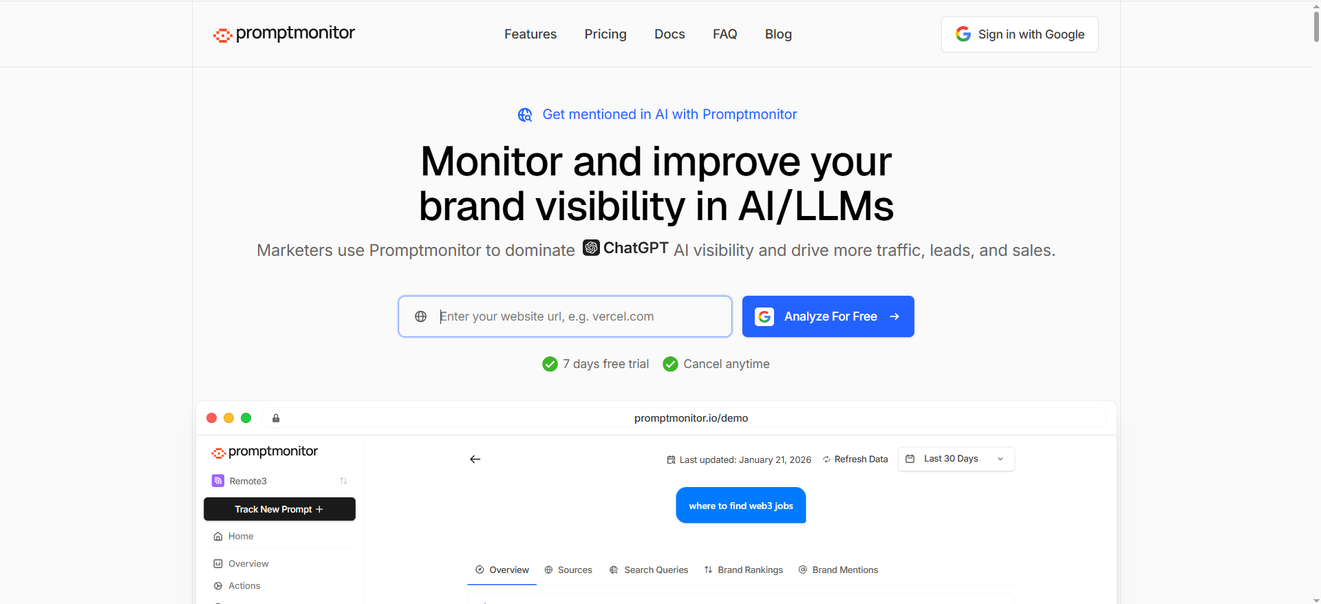
What it does
PromptMonitor is positioned as a monitoring solution that tracks brand visibility across major AI platforms, including visibility scoring and multi-platform coverage.
Why teams use it
- Lightweight way to track “are we showing up?”
- Helpful scoring for visibility and consistency across models
- Useful when you’re building an early AI visibility motion and need something affordable/quick
Promptlayer’s review describes Promptmonitor’s visibility score, presence rate, cross-model consistency, and coverage across multiple AI platforms.
What it’s good for
- Early-stage monitoring and visibility scoring
- Teams that want multi-platform coverage and geo granularity (depending on plan/features)
- Marketers who want visibility signals without a heavy enterprise platform
When it’s a good fit
- You’re proving the AI visibility reporting loop before investing in enterprise tooling
- You can accept doing BI integration through exports/automation rather than a native connector
When it’s not a good fit
- You require a native Looker Studio connector today (not clearly documented in the sources above)
- You want a mature, well-documented BI field schema out of the box
How to use it
If your tool doesn’t ship a Looker connector, your BI path is usually:
- Export data (CSV or scheduled report)
- Sync it to Google Sheets / BigQuery / a database
- Use Looker Studio connectors:
- Looker Studio community connectors can connect to internet-accessible data sources
- ETL tools like Coupler can automate feeds into Looker Studio
Key capabilities
- Visibility scoring approach (presence + consistency)
- Market positioning as visibility tracking and optimization
Pricing
Promptmonitor’s pricing starts at $29/month.
Free tier?
Promptmonitor doesn’t list a free-forever tier, but it does offer a 7-day free trial.
Downsides / limitations
- BI integrations may require more DIY unless a native connector/API is documented for your plan.
- Reporting reliability depends on how cleanly exports map to your desired dimensions (prompts, tags, engines, geos).
How to choose? Decision tree
Choose based on your reporting maturity and data path:
If you need dashboards live this week (no engineers)
Pick OtterlyAI or Peec AI because they’re explicitly designed to pipe visibility data into Looker Studio via connectors.
If you have BI maturity (warehouse + modeling)
Pick Profound (API + SDKs) and build a clean pipeline so “AI visibility” becomes a first-class KPI you can join with revenue, attribution, and content production.
If you’re enterprise SEO and want one system
Pick Conductor if your organization wants AI visibility data integrated with SEO, technical health, and content workflows, and accessed programmatically via API.
If you’re validating the motion (budget + speed)
Use PromptMonitor to start tracking, then graduate to a connector/API-first setup once stakeholders demand more dimensions, better governance, or client dashboards at scale.
Best AI visibility tools with Looker Studio connector
If your #1 requirement is “I need a stakeholder-ready dashboard in Looker Studio with minimal engineering”, prioritize tools that ship an actual Looker Studio connector (native or community) and expose enough fields to answer the questions leadership asks (coverage, share-of-voice, citations, competitors).
The short list (connector-first)
- OtterlyAI — Strong “reporting-first” positioning: pull AI visibility data directly into Looker Studio for dashboards, automated reports, and sharing with teams.
- Peec AI — Provides a Looker Studio community connector designed to import AI search visibility data for custom dashboards; their docs call out coverage across engines like ChatGPT, Perplexity, and Gemini.
If you’re shopping purely for “Looker Studio connector,” these two are the most clearly documented connector offerings in the set we discussed. (Other tools may integrate via API/export, but connector clarity matters when you need speed + reliability.)
What to evaluate (so you don’t get stuck with a pretty-but-useless dashboard)
1) Field completeness (what you can chart):
You want at least:
- A visibility metric (coverage/visibility score)
- A competitive metric (share-of-voice / share-of-answer)
- A citations/source view (domains + counts, ideally URLs too)
OtterlyAI explicitly markets Looker Studio reporting for AI visibility dashboards and reporting workflows. Peec’s connector is designed to import AI search visibility data to create custom dashboards.
2) Dimensions (how you can slice):
Your connector should let you break results down by things like:
- Date
- Brand / competitor set
- Source domain (and ideally URL)
- Engine/model (if the tool tracks it)
- Prompt tag/topic (nice-to-have, but hugely useful)
3) “Sharing model” (clients/stakeholders):
A huge BI advantage is sharing dashboards without extra tool seats. If your workflow is “weekly client review,” connectors win because you standardize delivery in Looker Studio.
4) Data freshness & stability:
If the connector is community-built, expect occasional quirks (auth warnings, missing dimensions). Peec’s docs acknowledge Google’s “unverified app” warning flow for community connectors.
5) Scale:
If you’re tracking hundreds of prompts across multiple markets, consider whether connector-only is enough, or whether you’ll eventually want an API → warehouse model.
AI visibility dashboard template Looker Studio
Here’s a proven Looker Studio template structure you can copy for AI visibility reporting. The goal: exec clarity on page 1, diagnostics on pages 2–4.
Also worth noting: Looker Studio community connectors exist specifically to connect Looker Studio to internet-accessible data sources, which is why many AI visibility vendors ship community connectors first.
Page 1 — Executive Overview (the “10-second truth”)
Widgets
- Scorecard: Visibility / Coverage %
- Scorecard: Share-of-voice (or “share of answer”)
- Time series: Visibility over time
- Bar chart: Visibility vs top competitors (current period)
- Filter controls: Date range, Engine/Model (if available), Prompt tag/topic (if available)
What this page answers
- Are we trending up or down?
- Who’s beating us, and by how much?
- Is this change broad (all prompts) or narrow (one cluster)?
Page 2 — Competitive Wins & Losses (where you’re getting displaced)
Widgets
- Table: Prompt cluster/tag → top recommended brands
- Table: Competitor delta (WoW / MoM)
- Trend line: Your rank/position over time (if the tool supports ordering)
Add a simple “displacement” calc
- Displacement Rate = (% prompts where competitor appears AND you don’t) / total promptsThis helps you move from “visibility” to “why we’re losing.”
Page 3 — Citations & Sources (what AI uses as evidence)
This is the page stakeholders find most “new” and most actionable.
Widgets
- Table: Top cited domains (count + share)
- Trend line: Citations to your domain over time
- Table: Top cited URLs (if available)
Why this matters: a lot of modern AI visibility measurement focuses on citations and share-of-voice concepts similar to classic SEO share-of-voice thinking.
Page 4 — Prompt Library & Actions (what to do next)
Widgets
- Table: Prompt list with visibility/coverage + competitor winners
- Table: Missing coverage prompts (where you’re absent)
- Notes / action panel (manual, but keeps the dashboard operational)
Action mapping examples
- Missing on “alternatives” prompts → build “Alternatives to X” content hub
- Losing citations to competitor domains → update/expand your authoritative pages
- Getting mentioned but not recommended → improve comparison pages and proof points
Template starter: build it in ~30 minutes
- Connect data source (vendor connector OR warehouse table).
- Create 4 pages using the layout above.
- Add filters: date range first, then brand/competitor, then topic tag.
- Add 3 “must-have” tables:
- Top competitors
- Top cited domains
- Missing coverage prompts
How to model AI visibility score in BI
If you’re serious about BI integrations, you need a model that survives:
- changing prompt sets,
- multiple engines/models,
- and “visibility” metrics that differ by vendor.
Think in fact tables + dimensions, not “one spreadsheet.”
Recommended warehouse schema
Fact table: ai_visibility_observation (grain = one run per prompt per engine per brand)
- date_time
- engine (ChatGPT / Perplexity / Gemini / etc.)
- prompt_id
- brand_id
- is_mentioned (0/1)
- rank_position (nullable)
- citations_count
- citation_domains (array or separate mapping table)
- source_urls (optional)
Dimension tables
- dim_prompt (topic, intent stage, tag, language, region)
- dim_brand (brand name, owned domains)
- dim_engine (engine/model identifiers)
- dim_competitor_set (if you change competitors by product line)
This structure lets you answer:
- “Are we improving overall?” (rollups)
- “Where exactly?” (prompt tag/engine slices)
- “Why?” (citations/sources)
A practical “AI Visibility Score” that won’t mislead execs
Don’t try to build a perfect score. Build a score that:
- is explainable,
- trends well,
- and correlates with “being recommended.”
Here are three layers:
Layer 1: Presence (binary)
- Presence Rate = AVG(is_mentioned)
Layer 2: Competitive weighting
- Share-of-Answer (simple) = mentions of your brand / total mentions across all brands in the competitor set(If your vendor provides share-of-voice/share-of-answer, use theirs,just store the raw metric too.)
Layer 3: Evidence (citations)
- Citation Share = citations to your owned domains / total citations across competitor domains
Now build a combined score (example weights):
- Visibility Score = (Presence Rate * 0.50) + (Share-of-Answer * 0.30) + (Citation Share * 0.20)
Why include citations? Because many AI visibility approaches increasingly treat citations and “share-of-voice” style metrics as core indicators of visibility quality, not just raw mentions.
Normalization tips (so week-to-week trends are real)
1) Freeze a “core prompt set”
Keep a stable set for trend reporting. Add an “experimental” set separately.
2) Engine weighting
If you track multiple engines, weigh them based on business relevance (or keep separate dashboards).
3) Winsorize volatility
AI outputs can be noisy. Consider weekly aggregation and outlier handling for rank and citations.
4) Keep raw data
Always keep raw prompt-level observations so you can re-aggregate later when leadership changes definitions.
OtterlyAI Looker Studio connector vs Peec connector
Both can power Looker Studio dashboards, but they feel different in practice: OtterlyAI is “reporting-first”, while Peec is “connector + custom dashboard flexibility.”
Setup + connector type
- OtterlyAI: Promotes a Looker Studio connector for pulling AI visibility data into Looker Studio for custom dashboards and automated reporting.
- Peec: Ships a Looker Studio community connector for importing AI search visibility data into Looker Studio dashboards.
Looker Studio community connectors are designed to connect to internet-accessible sources (which is why you’ll sometimes see extra auth steps).
Field coverage (what you can actually build)
Peec connector docs (as documented) highlight importing brand performance data from AI search engines and building custom dashboards. Peec’s product messaging also calls out streaming visibility and “source data” into custom dashboards via Looker Studio.
OtterlyAI messaging centers on AI visibility reporting workflows and Looker Studio as the sharing layer.
Reality check: A practitioner note (LinkedIn) suggests some metrics/dimensions visible in Peec’s UI may not yet appear in the connector (e.g., prompt dimension). Treat this as directional, not definitive, and validate during a trial.
Best-fit scenarios
Choose OtterlyAI if:
- You want the most straightforward “connect → dashboard → share” flow
- You’re building client dashboards and need speed
- Your core needs are visibility + citation reporting in Looker Studio
Choose Peec if:
- You want flexibility in how you design dashboards
- You care about streaming visibility + source data into Looker Studio for reporting workflows
- You’re okay with community connector quirks during setup
Decision shortcut
- Agency / fast reporting → OtterlyAI
- In-house growth team / analytics-heavy dashboards → Peec
- Need warehouse governance → neither connector alone; plan API → warehouse (or confirm vendor API options)
Conductor AI visibility data API use cases
Conductor has been explicit about the limits of scraping and the need for structured, grounded monitoring via an API. In their own write-up, Conductor argues that if you can’t distinguish grounded vs ungrounded answers, you’re not measuring real AI search visibility, and they position their data API as solving that by capturing grounded AI responses with structured metadata.
Here are the highest-leverage use cases when you can access AI visibility via a data API (especially in BI environments).
1) Trustworthy monitoring at scale (grounded responses)
Problem: Manual checks and scraping tend to be brittle and can capture “static” model behavior instead of search-backed behavior.
API value: Capture structured metadata so your measurement reflects real, grounded outputs.
BI output: A weekly executive view you can defend in a meeting.
2) BI dashboards that join AI visibility with your business KPIs
With an API, you can land data in a warehouse and join to:
- GA4 / Adobe sessions
- Conversion events
- Pipeline / revenue (CRM)
This unlocks dashboards like:
- “Visibility up → did assisted conversions move?”
- “Citation shared to our domain ↑ → did traffic to those pages ↑?”
3) Competitive intelligence and “displacement alerts”
Create rules like:
- Alert when competitor becomes #1 recommendation across a core prompt cluster
- Alert when your citation share drops below a threshold
- Alert when a new domain becomes a top cited source (signals a new content competitor)
Then feed those alerts into:
- Slack/email
- A Looker Studio “Alerts” page
- A weekly exec summary
4) Source strategy (digital PR + content partnerships)
If your API captures “who AI cites,” you can build:
- A ranked list of high-influence domains in your category
- Gaps where your brand is absent but competitors are cited
- Outreach targets (PR, partnerships, contributor strategies)
5) Content operations: prompt → page mapping
Operationalize “visibility work” like SEO work:
- Map prompt clusters to content clusters.
- Track which pages are being cited (or should be)
- Prioritize refreshes on pages tied to high-value prompts (often the same workflows you’d use for rewriting old blog posts for AI search visibility).
6) Governance, audit trails, and experimentation logs
When leadership asks “why did visibility change,” the best answer is: “We changed X on page Y” (and you can pressure-test that with evergreen visibility trends).
- “Competitor launched Z”
- “Citations shifted from domains A → B”
API pipelines enable audit logs and experiment tracking (similar to SEO annotations).
FAQs
A connector is usually “plug in and visualize,” while an API is “pull raw data and build your own pipeline.” Community connectors are designed to connect Looker Studio to internet-accessible data sources. API-first approaches (like Profound) are better for governance and blending data.
OtterlyAI documentation states it does not currently offer an API for exporting data (it’s on the roadmap).
OtterlyAI’s connector documentation lists extensive brand and citation fields (coverage, mentions, share-of-voice, ranks, citations, URL-level citations). Peec documents visibility/citations fields and clear dimensions like brand, domain, and date.
Yes. You can export data, land it in Sheets/BigQuery, then use Looker Studio connectors (or an ETL tool that feeds Looker).Looker Studio community connectors are explicitly meant for connecting to internet-accessible data sources.
One page: Coverage % trend Share-of-voice vs top competitors Top cited domains “What we’re doing next” action boxIf it can’t be understood in 10 seconds, it won’t be used.
If you’re monitoring a sensitive category (competitive SaaS, reputation-heavy verticals), daily/weekly checks are common.For most teams, weekly reporting is enough,provided you keep the prompt set stable and track trends rather than obsessing over single-response volatility.
If you need attribution joins, consistent KPI definitions, or you run multiple tools/sources, yes. That’s why API-first options (Profound) and enterprise data APIs (Conductor) matter.
Clients: clear outcomes, trends, competitive position, and actions taken.Internal: deeper prompt/citation drilling, experimentation logs, and pipeline tie-ins.
Final recommendation (and a simple “pick one” shortcut)
If you want the fastest path to a polished BI-ready dashboard:
- Pick OtterlyAI if you want a documented Looker Studio connector with rich fields and a prebuilt template, and you don’t need an API today.
- Pick Peec AI if you want a Looker Studio community connector with clear field definitions and a solid visibility/citations data model.
- Pick Profound if you’re serious about BI integrations beyond dashboards, API + SDKs make it the best foundation for a warehouse-first visibility program.
- Pick Conductor if your organization wants AI visibility embedded into enterprise SEO workflows and accessed via a broader Data API.
- Pick Promptmonitor if you’re validating the workflow and can accept building the BI layer through exports/automation.
📋Get Listed / Advertisement
We update this guide monthly. Want your tool featured? Contact: [email protected].


