

AI visibility reporting has a new problem: the data lives in one place, the client wants it somewhere else, and they want it branded like it came from you.
That’s why “white-label dashboards” matter for GEO/AEO. It’s not enough to tell a client, “Your brand showed up in ChatGPT 18% of the time.” You need to show:
- Where you appeared (engine + market + prompt cluster)
- How you appeared (rank/position + sentiment + narrative)
- Why you appeared (citations/sources)
- What changed (week-over-week, month-over-month)
- What to do next (content, PR, technical, authority plays)
And you need to ship that in a format clients actually consume: a branded PDF, a shared BI dashboard, or an embedded view inside your portal.
Below is a tool shortlist built specifically for teams that need white-label reporting paths, via BI connectors, exports, or APIs, not just screenshots.
Table of Contents
If you want the easiest white-label dashboard workflow, start with tools that give you exports + a BI connector so you can brand reporting in Looker Studio/Power BI/Tableau.
- Best for agency-friendly BI dashboards (connector + exports + API): Peec (CSV exports, Looker Studio connector, and an API).
- Best for prompt-based monitoring + Looker Studio (and clear pricing): OtterlyAI (Looker Studio connector on paid plans + exports, with some export limitations).
- Best for enterprise teams that want broader platform + governance: Profound (enterprise positioning, multiple engines, and security posture; pricing is customized).
- Best for end-to-end enterprise workflow (visibility → impact → workflows) + APIs: Conductor (AI Search Performance plus reporting APIs).
- Best lightweight starting point with simple plans: Prompt Monitor (entry plans and straightforward monitoring positioning).
📋 Get Listed / Advertisement
We update this guide monthly. Want your tool featured? Contact: [email protected].
Best AI Visibility Tools with White-Label Dashboards (Quick Comparison)
| Tool | Best for | White-label dashboard path | Pricing (starting) |
|---|---|---|---|
| Peec | Agencies & teams that want BI-ready reporting | CSV exports + Looker Studio connector + API | €89/mo (Starter) |
| OtterlyAI | Prompt monitoring + branded reporting workflow | Exports + Looker Studio connector (plan-dependent) | $29/mo (Lite) |
| Profound | Enterprise AEO programs & governance | Typically via enterprise dashboards + integrations; pricing customized | Custom / enterprise |
| Conductor | Enterprise SEO + AEO workflow + ROI tie-in | Platform dashboards + reporting APIs (build client portal/BI) | Enterprise / sales-led (varies) |
| Prompt Monitor | Simple monitoring, smaller teams | Shareable dashboards; BI export depends on your workflow | $49/mo (Pro) |
Note: “White-label” is often achieved via BI (Looker/Power BI/Tableau) using exports/APIs, even when the tool itself isn’t fully white-labeled. That’s usually the most reliable approach long-term.
1. Peec

What it does
Peec is an AI visibility analytics platform positioned around tracking brand performance across AI-driven discovery and providing reporting-friendly outputs like exports, a Looker Studio connector, and an API.
Why teams use it
If you’re building client-ready dashboards, Peec’s reporting surface is a core strength: it explicitly promotes clean CSV exports, a Looker Studio community connector, and an API for automation.
What it’s good for
- Agencies that want a repeatable “export → BI → white-label” pipeline
- Multi-client reporting where you standardize a dashboard template
- Teams that need to operationalize reporting without manual screenshot work
When it’s a good fit
Pick Peec when your #1 requirement is white-label deliverables:
- A branded Looker Studio dashboard per client
- Scheduled exports into a warehouse/spreadsheet
- API-driven reporting inside your portal
When it’s not a good fit
If you’re looking for a fully managed enterprise program with heavy governance, procurement workflows, and broad internal stakeholder tooling, you may prefer an enterprise suite like Conductor or a platform positioned around enterprise controls like Profound.
How to use it
- Define your prompt set as a reporting asset (cluster by use case: “best X for Y,” “alternatives,” “pricing,” “reviews,” “implementation”).
- Run baseline tracking for 2–4 weeks so you have trendlines.
- Export the data (CSV) weekly, and store it in a “client reporting” folder or warehouse table.
- Use the Looker Studio connector to build a template dashboard (one template, duplicated per client).
- Brand it: client logo, your agency name, your colors, and a “What changed / What we’ll do next” panel.
- Automate: if you have engineering support, use the API to push data into your reporting layer on a schedule.
Key capabilities
- “Export clean .csv files” for flexible reporting.
- Looker Studio connector for client-ready dashboards.
- API for automation and stack integration.
Pricing
Peec’s pricing starts at €89/month, with a Pro plan at €199/month and an Enterprise plan priced by quote.
Free tier?
Peec doesn’t list a free tier, but it does offer a “Start for free” sign-up flow on its pricing page.
Downsides / limitations
- As with any prompt-based AI visibility tracker, your reporting quality depends on the prompt set you maintain (this is a feature and a responsibility).
- Some engine coverage can involve add-ons (not unique to Peec).
- If your clients demand in-tool white-label portals (not BI-based), you’ll still likely do the white-labeling in Looker/Power BI.
2. OtterlyAI

What it does
OtterlyAI is built around search prompt monitoring, you create prompts and the platform monitors them (daily on available engines), tracking brand visibility and citations.
Why teams use it
OtterlyAI is popular for agencies because it’s:
- Clear, prompt-based pricing (easy to package into retainers).
- Built around monitoring workflows (prompts + engines + countries).
- Designed to support reporting and export, though you should understand what’s exportable and what isn’t.
What it’s good for
- Agencies that need a practical “prompt monitoring” productized service
- Teams that want citation export to turn into link/PR outreach plans
- Multi-country monitoring (useful for global clients)
When it’s a good fit
OtterlyAI shines when you want:
- A predictable prompt-based system you can explain to clients
- Dashboards + exports for building a BI layer
- A plan that scales with the number of prompts you manage
When it’s not a good fit
If you require exporting every report artifact: note that OtterlyAI’s help center states that brand report data can’t currently be exported (at least per that article’s status).
That doesn’t kill white-labeling, because you can still export prompt/citation datasets; but it changes what you build your BI dashboard on.
How to use it
- Build a prompt library (category pages, alternatives, comparisons, “best for,” implementation questions).
- Add prompts into OtterlyAI (manually or using its prompt research tooling).
- Choose markets (countries) and engines (including add-ons where needed).
- Export prompt visibility and citations periodically.
- Push into Looker Studio / Power BI and white-label the dashboard. (OtterlyAI also lists a Google Looker Studio Connector on paid tiers.)
Key capabilities
- The pricing page explicitly lists “Detailed Reports & Export” and a Google Looker Studio Connector on higher tiers.
- Export options include (1) prompt visibility data and (2) citation link exports.
- It frames monitoring around a daily cadence, aiming to emulate user experience while avoiding personalization-based tailoring in the reported outputs.
Pricing
OtterlyAI’s pricing starts at $29/month.
Free tier?
OtterlyAI doesn’t offer a free tier, but it does offer a free trial for new users.
Downsides / limitations
- Export limitations: “brand report” export is noted as not currently available in the export help doc.
- Engine coverage for Google AI Mode / Gemini is described as add-ons on the pricing page.
- Like all prompt monitoring, you must manage prompt drift and consistency.
3. Profound

What it does
Profound positions itself as a platform to help brands get mentioned across a wide set of answer engines and assistants (e.g., Perplexity, ChatGPT, Claude, Gemini, Copilot, and others listed on its site).
Why teams use it
Profound leans strongly into:
- Enterprise readiness and governance (SOC 2 Type II, SSO options, enterprise support posture).
- A broader platform that includes multiple modules (e.g., “Answer Engine Insights,” “Agent Analytics,” “Workflows,” “Shopping”).
What it’s good for
- Enterprise teams running AEO as a cross-functional program (marketing + PR + web + analytics)
- Organizations that need security posture and identity controls
- Teams that want a platform view (visibility + insights + workflows)
When it’s a good fit
Choose Profound if your requirements include:
- Enterprise procurement expectations (security/compliance)
- A broader AEO platform rather than a single-purpose monitoring tool
- High-stakes stakeholder reporting (brand risk + visibility + citations)
When it’s not a good fit
If you’re a lean agency that needs quick self-serve pricing and simple packaging, Profound may be heavier than needed, especially because it states it is “designed for enterprise brands” and pricing is customized enterprise pricing.
How to use it
Most enterprise teams white-label reporting by building:
- A stakeholder dashboard (internal)
- A client/business-unit dashboard (semi-external)
- A leadership “AEO scorecard” PDF (executive-ready)
Even if a platform has strong dashboards, the safest long-term white-label pattern is still: export/API → BI/warehouse → branded delivery.
Key capabilities
From Profound’s site, it emphasizes tracking how often your brand appears, analyzing AI responses, and uncovering citations (websites driving answers).
It also emphasizes enterprise controls like SOC 2 Type II compliance and SSO.
Pricing
Profound’s pricing starts at $99/month, with higher tiers (and enterprise pricing) available beyond that.
Free tier?
Profound doesn’t offer a free tier, but it does offer a demo.
Downsides / limitations
- Not self-serve pricing (harder for agencies to package without sales cycles).
- Enterprise platforms can be more complex to operationalize; you’ll want a clear internal owner and reporting cadence.
4. Conductor

What it does
Conductor positions itself as an enterprise AEO platform that connects visibility to business outcomes, and offers AI Search Performance capabilities like engine coverage, topic/prompt analysis, workflow integration, and traffic/conversion insights.
Why teams use it
Conductor stands out when you need:
- A single platform that aligns AEO + SEO workflows for enterprise teams
- Visibility tracking plus impact measurement (traffic + engagement + conversions)
- API-driven reporting/integration paths suitable for portals or BI layers
What it’s good for
- Enterprise teams that need AEO reporting tied to ROI
- Organizations with multiple stakeholders (SEO, content, analytics, web)
- Agencies serving enterprise clients who need governance + integration
When it’s a good fit
Use Conductor if you want to report:
- Share of voice and competitive market share for AI conversations
- Visibility by topic/prompt and region/domain
- The connection between AI visibility and traffic/conversion outcomes…and you need APIs to push data into your reporting surface.
When it’s not a good fit
If you just need lightweight monitoring for a small client set, Conductor can be more platform than you need (enterprise product posture).
How to use it
There are two common “white-label” routes with Conductor:
Route A: BI/Portal build (most controllable)
- Use Conductor reporting APIs to pull data into your warehouse/BI and present it in your branded client dashboard. Conductor describes reporting APIs that provide programmatic access and are used to request reports and extract metrics.
Route B: Hybrid platform + executive summary
- Use Conductor’s platform dashboards for analysts
- Ship a white-labeled executive PDF monthly (built from exported charts + your narrative)
Key capabilities
Conductor’s AI Search Performance page highlights:
- Broad engine coverage (including ChatGPT, Perplexity, Google AIO, and more)
- Topic & prompt analysis
- Traffic & conversion insights to prove ROI
- AI bot crawling reports (technical visibility)
For integrations, Conductor’s knowledge base describes reporting APIs that enable programmatic extraction and integration into other solutions/portals.
Pricing
Conductor’s pricing is not publicly listed; plans are available by quote.
Free tier?
Conductor doesn’t offer a free tier, but it does offer a free 3-week trial and a demo.
Downsides / limitations
- Enterprise platform complexity: you’ll want clear ownership and implementation planning.
- For agencies, you may still build white-label dashboards in BI for client-facing delivery.
5. Prompt Monitor
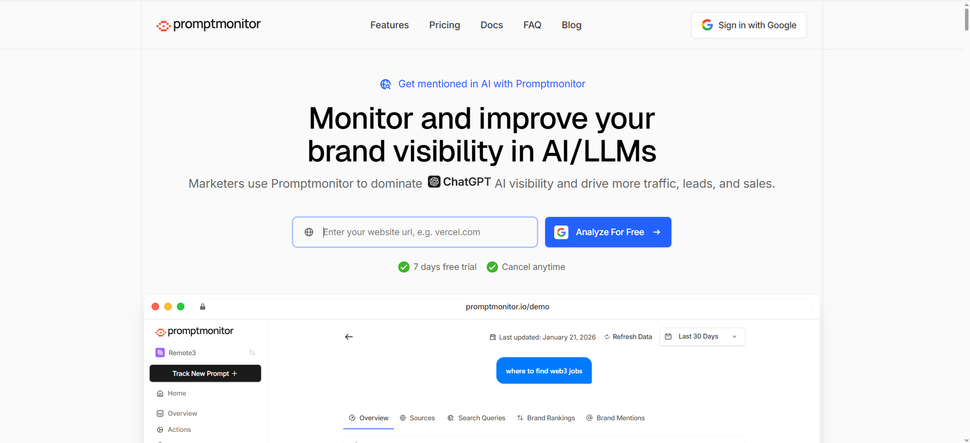
What it does
Prompt Monitor positions itself around monitoring your brand across LLMs (it explicitly mentions ChatGPT, Claude, and Gemini) and provides competitor analysis and detailed analytics.
Why teams use it
It’s straightforward:
- Clear, simple pricing tiers
- A basic monitoring + competitor analysis framing
- An approachable starting point for teams getting serious about AI visibility
What it’s good for
- Smaller teams that want to start tracking without heavy enterprise overhead
- A “starter” monitoring layer you can later upgrade or replace
- Testing your prompt library and reporting approach before committing to bigger stacks
When it’s a good fit
Pick Prompt Monitor when you want:
- A quick ramp into AI visibility monitoring
- A low-cost proof of concept
- A tool you can standardize across smaller clients (where the BI layer does the white-labeling)
When it’s not a good fit
If you need robust export/connectors/API for a large-scale agency operation, you’ll want to validate the reporting path early and consider tools that explicitly advertise connector/API workflows (e.g., Peec) or documented export paths (e.g., OtterlyAI).
How to use it
- Start with 10–50 prompts that represent your revenue-driving categories.
- Track competitor prompts alongside your own brand prompts.
- Use the results to build:
- A “Where we show up” view
- A “Where competitors win” view
- A “Next actions” list (content + authority + technical)
Key capabilities
Prompt Monitor highlights monitoring across multiple LLMs and competitor analysis.
Pricing
Prompt Monitor’s paid pricing starts at $49/month.
Free tier?
Prompt Monitor offers a free tier at $0/month.
Downsides / limitations
- For true white-label client reporting, you may still rely on BI (export/manual ingestion) unless you confirm connector/API capabilities.
What “white-label dashboards” really means for AI visibility reporting
When teams say they want “white-label dashboards,” they usually mean one of these three levels:
1) Branded deliverables (PDF/Slides)
You export charts/tables (or rebuild them) and deliver a monthly report with:
- Your logo
- Client logo
- A consistent scorecard layout
- Narrative insights + recommended actions
This is the easiest to implement, but it’s the least interactive.
2) Branded BI dashboards (the sweet spot)
This is the “white-label via BI stack” approach:
- Pull data via CSV export / connector / API
- Build dashboards in Looker Studio / Power BI / Tableau
- Share with the client under your branding (or embed in a client portal)
This is typically the best balance of speed, customization, and scalability, especially when the tool offers a Looker Studio connector (Peec, OtterlyAI) or strong export paths.
3) Embedded reporting inside your client portal (highest leverage)
You create a portal experience where the client logs into your system and sees:
- AI visibility KPIs
- Trend charts
- Prompt clusters
- Citation source lists
- Actions / tasks / backlog
This usually requires API access and some engineering, but it’s a powerful retention moat.
The KPI set clients actually understand (and will renew for)
If you want a dashboard that survives executive scrutiny, keep it centered on 8–12 metrics that map to business language:
- AI Visibility Rate (how often you’re mentioned across tracked prompts)
- Share of Voice (mentions vs competitors in the same prompt set)
- Average Position / Rank (when ranked lists appear)
- Citation Coverage (how often your site is cited / which URLs are cited)
- Source Diversity (how many unique domains drive AI answers)
- Sentiment / Tone (brand portrayal)
- Market Segmentation (country/region differences)
- Topic Clusters (where you win/lose by category)
- Change Over Time (WoW/MoM deltas)
- Impact Proxy (AI referral traffic trend / assisted conversions, if available)
Conductor explicitly emphasizes tying visibility to traffic and conversion insights, which is exactly the story executives want.
The white-label playbook: how to deliver client-ready dashboards (BI-stack approach)
This is the practical blueprint agencies use when they want scale.
Step 1: Standardize the data model (so every client dashboard is templated)
At minimum, you want these fields:
- Client / Brand
- Prompt (plus prompt cluster/category)
- Engine (ChatGPT, Perplexity, Google AIO, etc.)
- Market (country/locale)
- Date (run date)
- Mentioned? (Y/N)
- Rank/position (if applicable)
- Citations (URLs/domains)
- Competitors present (optional)
- Notes (qualitative insight)
OtterlyAI’s export documentation shows the kind of prompt-level and citation-level fields you can expect (prompt, country, service, title, URL, order, date).
Step 2: Pick your “white-label path” (connector vs export vs API)
Fastest: Looker Studio connector (when available)
- Peec explicitly promotes a Looker Studio connector for pulling data across projects.
- OtterlyAI lists a Google Looker Studio connector on higher tiers.
Most universal: CSV exports
- Peec: clean CSV exports.
- OtterlyAI: exports for prompt visibility and citations.
Most scalable: API → warehouse → BI / portal
- Peec mentions an API for automating reporting and fitting into your stack.
- Conductor provides reporting APIs for extracting data and integrating into portals/solutions.
Step 3: Build one reusable dashboard template (then clone it)
A strong white-label AI visibility dashboard usually has 6 pages:
- Executive summary (scorecard + 3–5 takeaways)
- Visibility trends (overall + by engine + by market)
- Prompt clusters (wins/losses by category)
- Competitor comparison (share of voice + head-to-head prompts)
- Citations & sources (domains/URLs driving answers)
- Action plan (content backlog + authority targets + technical fixes)
Step 4: Add a narrative layer (the part clients pay for)
Dashboards don’t renew contracts, interpretation does.
Every reporting cycle, include:
- “What changed and why”
- “What we’re doing next”
- “What we need from you” (SMEs, product updates, approvals)
- “What success looks like next month”
Step 5: QA the report like an analyst (not like a copywriter)
AI answers are stochastic. Build trust with simple QA habits:
- Re-run a small sample of prompts manually each month
- Check whether major deltas are real or “prompt drift”
- Validate citation shifts (new sources vs lost sources)
- Keep a changelog of prompt edits
OtterlyAI explicitly discusses neutrality/avoiding personalization in its monitoring explanation, which is helpful context when you explain why you can trust trendlines more than single snapshots.
Buying criteria: How to choose the right tool for your agency or team
1) Coverage & methodology
Ask:
- Which engines matter for your ICP?
- Do you need Google AI Overviews and AI Mode tracking?
- Do you need multi-country segmentation?
Conductor emphasizes broad engine coverage and tracking customization by region/domains.
OtterlyAI also emphasizes multi-country support and add-ons for Google AI Mode/Gemini.
2) Reporting flexibility (this is the white-label core)
You’re looking for at least one of:
- A BI connector (Looker Studio)
- Reliable exports (prompt-level + citations)
- An API (for automation/portal embedding)
Peec is strongest here because it explicitly calls out exports + Looker connector + API.
OtterlyAI’s export docs are also clear about what you can export (prompts + citations).
3) Multi-brand, multi-client management
Agencies need:
- Separate workspaces
- Role-based access
- Clean duplication of dashboards
OtterlyAI’s pricing page lists multi-workspace capabilities on higher tiers.
Enterprise platforms typically handle this via permissions and SSO (Profound highlights SSO).
4) Workflow fit (insights → action → proof)
If you want to show ROI, your stack must connect:
- Visibility changes → actions taken → outcomes
Conductor highlights connecting AI visibility to traffic and conversion insights.That’s a strong fit for teams who need the CFO-friendly story.
📋 Get Listed / Advertisement
We update this guide monthly. Want your tool featured? Contact: [email protected].
What counts as a “white-label dashboard” in practice?
“White-label” can mean three very different things in client reporting. If you don’t define the level up front, you’ll end up overpromising (or rebuilding dashboards every month).
Level 1: Branded report (PDF / Slides)
This is the most common “white-label” deliverable agency ship.
What it looks like
- A monthly PDF or slide deck with your branding (logo, colors, fonts)
- Client logo and business context on the cover
- A consistent scorecard page + insights + next actions
Pros
- Fast to produce
- Easy for execs to read
- Works even when tooling exports are limited
Cons
- Not interactive
- Harder to self-serve (client always asks for “one more cut”)
- Data freshness depends on manual updates
Best for
- Early-stage AEO programs
- Exec stakeholders who want narrative + summary
- Clients who don’t need daily monitoring
Level 2: Branded BI dashboard (Looker Studio / Power BI / Tableau)
This is usually the best “true white-label” solution because you control branding and layout completely.
What it looks like
- Data flows from a tool via export/connector/API
- You build the dashboard in BI (client sees your brand, not the vendor’s)
- You duplicate the same template for every client
Pros
- Fully brandable: header, theme, naming, layout
- Reusable template across clients
- Interactive filters (engine, market, prompt cluster, competitor)
- Easy to add other datasets (GA4, GSC, CRM)
Cons
- Requires clean data structure
- Some ongoing maintenance (schema changes, connector issues)
- Needs dashboard governance (permissions, edits)
Best for
- Agencies offering AI visibility reporting as a productized service
- In-house teams with multiple stakeholders
- Any client who asks for “a dashboard we can check anytime”
Level 3: Embedded dashboards inside your portal (client login, your domain)
This is “enterprise-grade white-label”, highest retention, highest effort.
What it looks like
- You pull data via API/export into your database/warehouse
- Dashboard is embedded into your web portal (or Notion-like portal)
- Client logs into your system, sees your reporting suite
Pros
- Strongest brand ownership
- Highest client stickiness (retention moat)
- Room for workflows (tasks, approvals, change logs)
Cons
- Engineering required
- More responsibility (security, access control, uptime)
- Needs stable APIs and a clear data model
Best for
- Agencies with many recurring clients
- Firms building an “analytics portal” as part of their offer
- Enterprise clients who want governance
The practical definition
If you want a definition you can safely put in an SOW:
A white-label dashboard is a client-facing reporting view delivered under the agency’s branding (logo, colors, naming), with vendor branding removed or minimized, and shared via BI link, embedded portal, or branded PDF, powered by exports, connectors, or APIs.
What KPIs should I put on a client-facing executive dashboard?
Executive dashboards should be small, stable, and story-driven. If you overload it with prompt-level noise, you’ll lose confidence fast.
Here’s a proven KPI set (8–12 metrics) that works for AI visibility and white-label reporting.
A) Visibility & market position (core)
- AI Visibility Rate (%)How often the brand appears across tracked prompts (by engine/market).
- Share of Voice vs Competitors (%)Mentions for your brand divided by total mentions across the same prompt set.
- Average Position / Rank (where applicable)When results are presented as ranked lists (best tools, top providers, etc.).
- Top Winning Prompt Clusters3–5 categories where you’re strongest (e.g., “best for SMB,” “pricing,” “alternatives”).
- Top Losing Prompt Clusters3–5 categories where competitors dominate.
Why execs like these: they’re comparative, directional, and easy to interpret.
B) Trust signals (what “powers” visibility)
- Citation Coverage (%)How often your site/domain is cited in AI answers when you appear.
- Top Citation Domains (Top 10)The publishers/sites AI systems cite most for your category (great for PR + partnerships).
- Citation Velocity (New vs Lost Sources)How many new sources started citing you this period vs how many stopped.
Why this matters: Execs don’t just want mentions. They want to know why the system trusts you.
C) Brand narrative quality (optional, but powerful)
- Sentiment / Brand Portrayal ScorePositive / neutral / negative portrayal (especially important for regulated or sensitive industries).
- Message Pull-Through (%)How often AI answers include your key differentiators (e.g., “SOC2,” “fast onboarding,” “works with X”).
Why this matters: Visibility without narrative control can be risky.
D) Outcome tie-in (the “renewal driver”)
- AI Referral Traffic Trend (GA4)Traffic from AI assistants or “referral” sources you can track.
- Assisted Conversions / Pipeline Influence (if possible), at minimum: landing page engagement trend for pages cited by AI.
Important note: Even if tracking isn’t perfect, execs love directional indicators.
The best executive dashboard layout
If you want a clean one-pager:
- Top row: Visibility Rate, Share of Voice, Avg Position
- Middle: Winning clusters / Losing clusters
- Bottom left: Top cited domains + your citation coverage
- Bottom right: “What changed” + “Next 3 actions”
What is the simplest “BI-stack” build (export → Looker → white-label)?
If you want the simplest setup that still scales, do this:
The simplest architecture (no engineering)
AI visibility tool → CSV export → Google Sheets → Looker Studio dashboard
Why this works:
- Google Sheets becomes your “database”
- Looker Studio connects easily to Sheets
- You can clone dashboards per client quickly
Step-by-step build (repeatable for every client)
Step 1: Create a “Client Reporting Sheet”
Tabs you want (minimum):
- runs (date, engine, market, prompt, brand_present, rank/position)
- citations (date, prompt, engine, cited_domain, cited_url, order)
- prompt_map (prompt → cluster/category → funnel stage)
Tip: Keep prompts in a mapping tab so you can update clusters without rewriting exports.
Step 2: Export on a schedule
- Weekly exports for smaller retainers
- Daily exports for enterprise monitoring
Drop exports into the Google Sheet (or upload CSVs to Drive and copy in).
Step 3: Build a Looker Studio template (once)
Create these pages:
- Executive summary
- Visibility trends
- Prompt clusters
- Competitor benchmarks
- Citations & sources
- Action plan
Add filters:
- Engine
- Market
- Prompt cluster
- Date range
Step 4: White-label the dashboard
- Put your agency logo top-left
- Put client logo top-right
- Use consistent naming (e.g., “AI Visibility Scorecard”)
- Add a “Reporting notes” panel (methodology + caveats)
Step 5: Clone for new clients
For each new client:
- Duplicate the Google Sheet template
- Duplicate the Looker Studio template
- Swap the data source to the new Sheet
- Replace logos and client name
- Done
If you want one upgrade (still simple)
Tool → export/API → BigQuery → Looker Studio
Why upgrade:
- Handles more data
- Cleaner joins and calculated fields
- Less breakage when sheets get messy
Use this when:
- You have many prompts + many clients
- You want stronger versioning and data governance
Common pitfalls (avoid these)
- Changing prompt text every month → breaks comparisons
- No prompt cluster map → dashboards become chaos
- Not separating runs vs citations → messy joins
- Overloading exec dashboard → too much detail, low trust
FAQs
Some tools offer shareable reports and dashboards, but “true white-label” (your domain/branding, client login, no vendor branding) is often best achieved by pushing data into Looker Studio/Power BI/Tableau via exports or APIs and branding it there. Peec explicitly supports exports, a Looker Studio connector, and an API, which makes this straightforward.
Peec promotes a Looker Studio community connector for client-ready dashboards. OtterlyAI lists a Google Looker Studio connector on paid tiers.
Yes, OtterlyAI’s export documentation describes an export of citation links that includes fields like prompt, country, service, title, URL, order, and date.This is useful for digital PR, partnership outreach, and authority-building campaigns.
Use consistent prompts, keep a changelog of prompt edits, and focus reporting on trendlines (weeks/months) rather than a single day’s snapshot. Also sample-check the biggest changes manually.
Start with the BI-stack approach: pick a tool with exports/connector (Peec or OtterlyAI), build one Looker/Power BI template dashboard, clone per client, ship an executive summary each month with “what changed / what we’ll do next.”
Profound highlights enterprise controls like SOC 2 Type II compliance and SSO options.Conductor is also positioned as an enterprise platform with workflow and integration support.
If the tool supports an API (or robust export automation), you can pull data into your backend/warehouse and embed dashboards. Conductor’s reporting APIs are explicitly described as being used for extracting data and integrating into portals/solutions.
A one-screen executive scorecard: Visibility rate, share of voice vs competitors, top winning prompt clusters, top lost clusters, and the top 10 citation domains (with “next actions” underneath).
📋 Get Listed / Advertisement
We update this guide monthly. Want your tool featured? Contact: [email protected].


